

This is a short one, but I felt it was interesting to share: My experience creating the main menu (title screen) and choosing the menu font for When It Games Dark.
When It Games Dark is an upcoming short terror graphic adventure / visual novel created by JB-Dev for Pixel Noire Games which mixes pixel art with low-res pictures:


Without spoiling too much, in the game the MC visits a small and mysterious village where, from the very first moment, you feel there’s something wrong going on.
The narrative gets progressively frightening as the villagers and you find cattle mutilations, lights roaming the night sky, and discover that a person that has gone missing, which you will have to rescue from whatever is haunting the town.
STEP 1. CHOOSING THE RIGHT REFERENCES
After playing for a bit, and researching the story in-depth, it was clear for me which should my two main sources of inspiration: The X-Files and Twin Peaks, two of the top supernatural terror / mystery series from the 90s.


I briefly considered if 80s aesthetics would fit (Stranger Things), or if it would be better to approach it from a more recent angle (Netflix’s Dark, Paranormal Activity…).
But ultimately I felt that 80s aesthetics might make it too kid oriented and break the immersion (Super 8, The Goonies…), and going for a more contemporary approach would kill the retro style derived from the low-res graphics and the pixel art.
The X-Files and Twin Peaks, on the other hand, were products where that had low resolution (due to the tech limitations of its time), yet were really immersive.
On top of this, I am a big fan both series and I thought that the mix of dark mystery to solve and you may regret what you learn that both have was a perfect match for this game.
STEP 2. TITLE SCREEN PICTURE
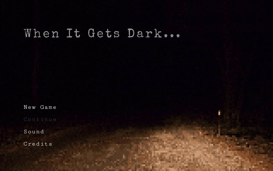
First impressions matter, and the title screen is the very first thing you see from a game.
JB-Dev had gone through several iterations of the title screen picture, always having the problem that it was either too revealing (which killed the “omg where am I getting into?” fun right away) or just uninviting to start.


But by that point, I knew exactly what I wanted to express with the title screen, and what should be the first impression of the player: That there was a mystery ahead, and hint how disturbing it will be to advance into it.
So I chose a picture that was not very revealing, yet transmitted that message: a night view of a road in front of a forest, with a small light on one of the sides.
In this picture, the POV of the player is in an illuminated area… as it walks further, it will enter in unknown territory, outside of the protection of the light, into unknown danger.

STEP 3. GAME FONT
For the typography in the menu font, I wanted to follow closely the inspiration of the X-Files series logo.
Given that the gameplay involved a lot of detective-like investigation, I wanted to give the feeling that the player was reading a report, by using a font which emulated the effect of letters typed on an old writing machine, to make it look like a police file.
As where to get the fonts themselves, Google Fonts is a service that provides us with good quality free fonts, which already make sure to solve most of the readability issues regarding fonts, so I try to use it as much as possible because it’s a time saver.
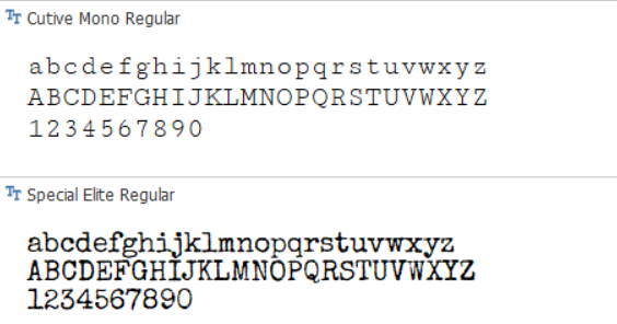
For titles, I chose Special Elite Regular since it is more robust.
And I chose Cutive Mono Regular for the menu options and normal text, since in this case it did not have to stand out as much.
I did a slight modification on both, though, by adding extra space between the letters, since I felt it was hard to read, specially on big chunks of text.
STEP 4. WRAPPING IT UP
With all the building blocks ready, it was time to put it all together.
My inspiration here were japanese terror games from early 2000s, as well as interactive menus from the X-Files DVD collection…


I particularly liked the “secret report” homodiegetic style from the X-Files DVD Collection menu and from Manhunt…
But after some quick testing I ultimately chose an arrangement of the buttons on the side, since it suited the picture better (instead of overlapping the road image), and it felt a bit more modern user-friendly..
I also added a grey color on the text so that it does not stand out excessively.
And this was the process to create the title screen and ingame fonts!
Thanks for reading!
Listening: Angelo Badalamenti – Laura Palmer’s Theme
